
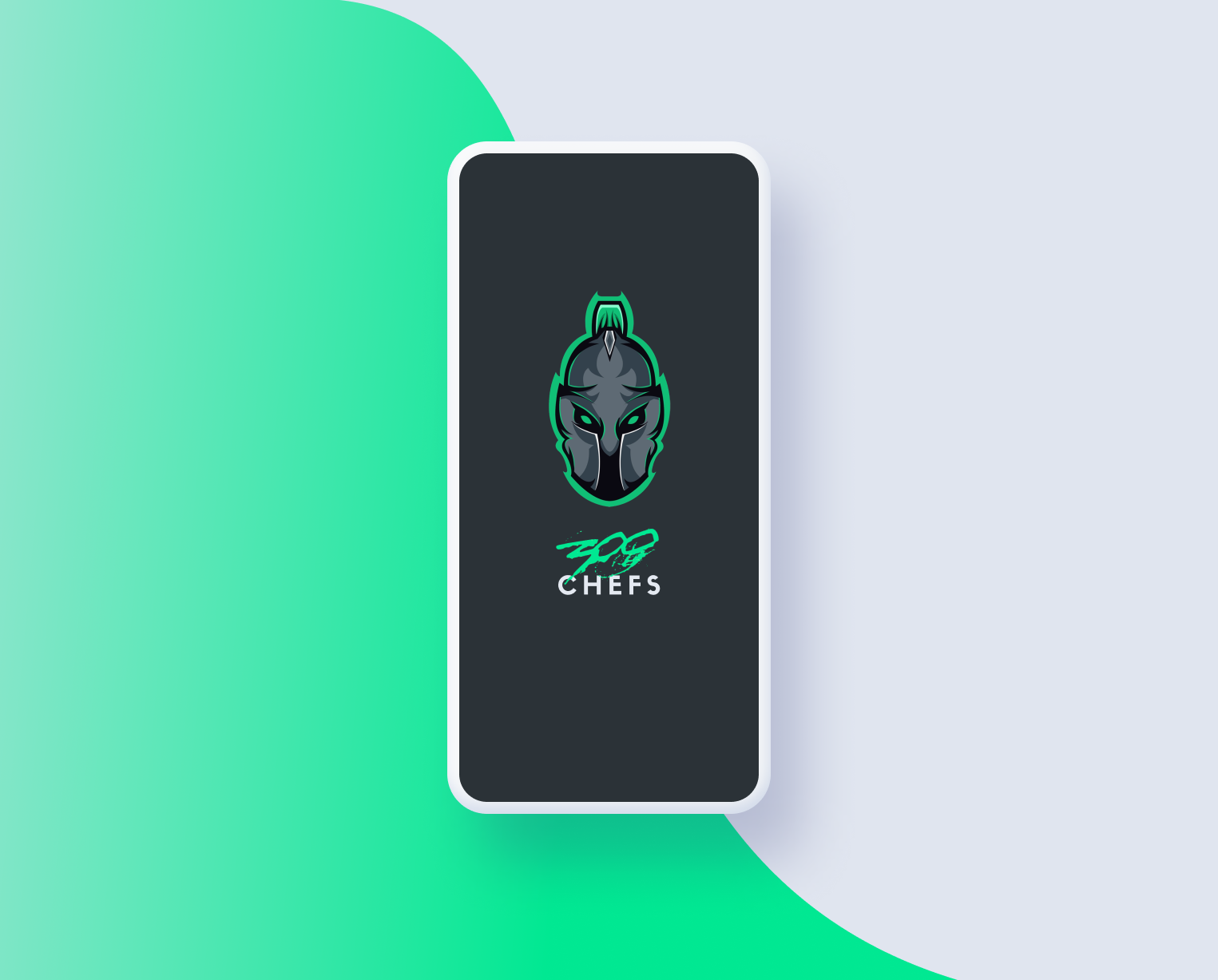
Project:
300 Chefs is an all-in-one after-market specialist group of over 800 subscribers. The team specializes in alerting members of any profitable drops instantly scraped from the website whenever they become available, helps with investing into the stock market, etc., essentially this is a goldmine for young entrepreneurs who want to tread the waters.
Role:
Lead UI/UX Designer
Team:
Co-founder of 300 Chefs
Co-Founder of 300 Chefs
UI/UX Designer (me)
Engineer
Problem:
At the time the group primarily retained membership through Discord. But they wanted to have their own app. The goal of this project was to create an app that would be a one-stop-shop for all of the resources that 300 Chefs have to offer.
Brainstorm:
The brainstorming process is always exciting, we worked together with members to see what they look for first when they log into the discord channel. We concluded that three things needed to be a priority:
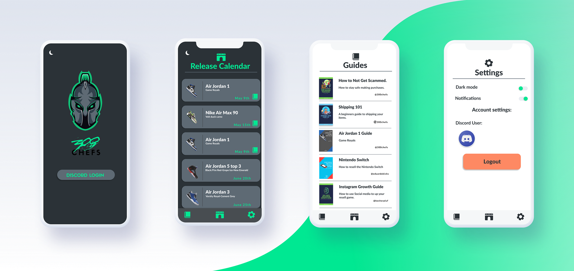
1. Dates are always where the eyes go first. Resellers have to know when to be ready for a drop. so we wanted to make sure that dates were a priority.
2. 300 Chefs is a hotspot for "beginners". What attracts many new subscribers are the guides they have that go in-depth about a product and its resell process. Having a page dedicated to Guides was also a must.
3. The reselling world can be a little unclear and sometimes even intimidating So keeping a level of professionalism in the theme was important for subscribers.
Research:
After having a full understanding of the concept I went on to interview 10 people who were in the world of after-market selling. The interview process helped us narrow down some key features we had to get right.
1. All the apps that exist already are not for novas users
2. The limited number of apps that were available had extremely confusing interfaces.
3. People need a place where they can also learn about products and potential investments opportunities.
4. What made 300 chefs stand out were their amazing guides that gave information about a product and the ins and outs of that particular sell. So it was important that we showcased them in an easy way.
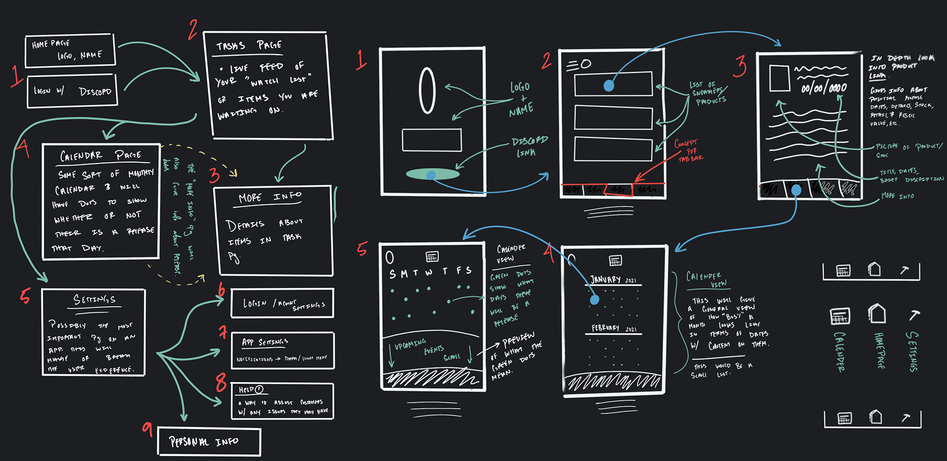
Wireframes:
Through trial and error, the team and I came to these pages being the main components we wanted to showcase in the app for the first stage of the applications development.


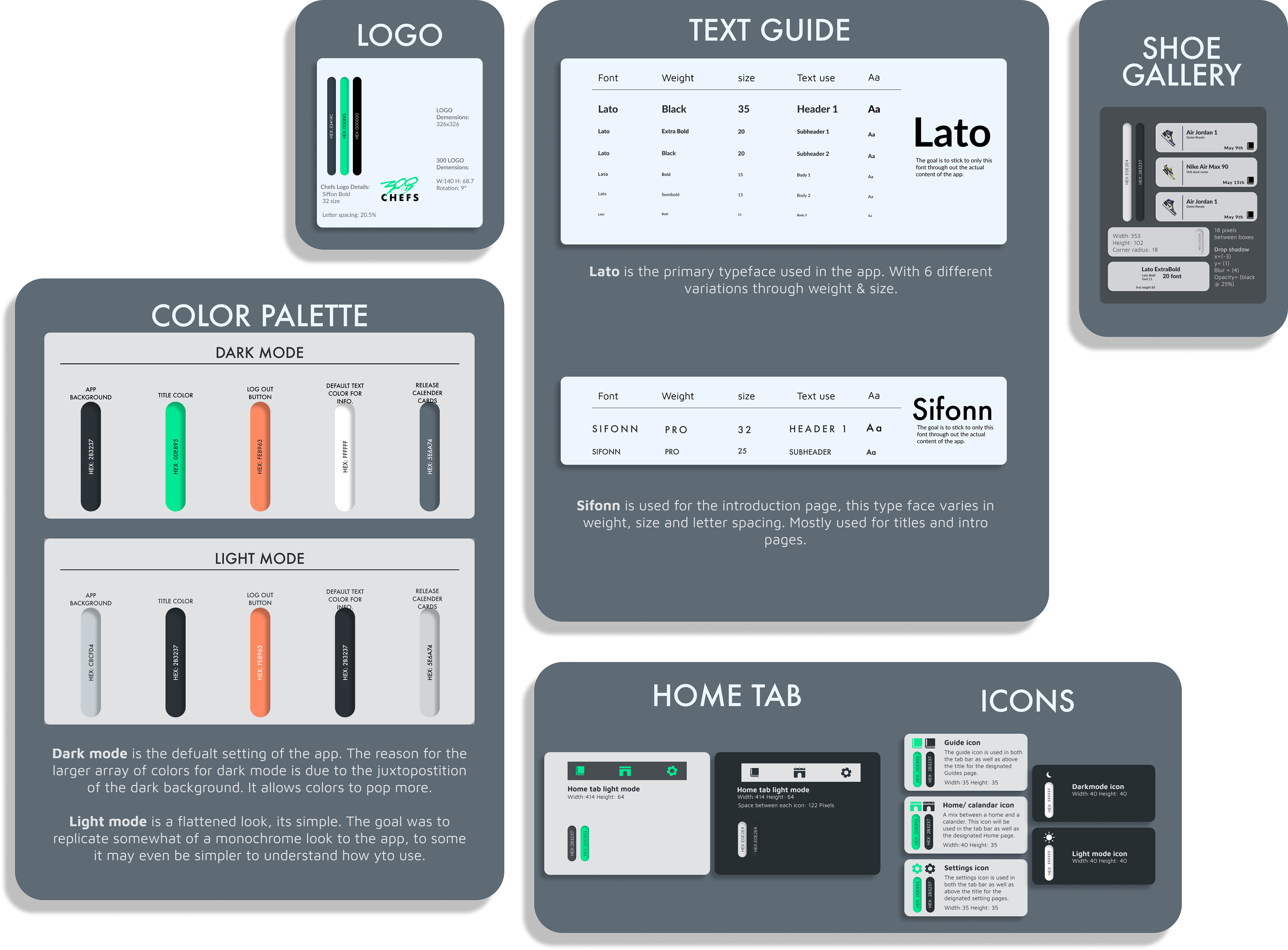
Style Guide:
Final Product:
Why did we land on this as the final?
Through trial and error, we decided on 6 pages of light and dark to not only be cost-efficient, but simple and effective as well. The simple list display allows clearly seeing upcoming releases. The guide icon on the release calendar for each shoe meant that they also had a guide that went with it, because every release doesn't have a guide I felt it was better to have a symbol to portray that there was more information about the release for certain products.
300 chefs eventually took the App Store to create their first IOS and Android app. This app helped them solidify their name in the vast world of reselling, eventually helping them not only retain their membership but also welcome 100's of new members increasing revenue two-fold.
Reflections, Limitations & Constraints:
I would have wished that the engineer was onboarded at the same time as the designer so that communication could be more fluid. The engineer was hired two days before the designs were done.
Due to the minimal budget, we couldn't do everything we wanted with the app, so even though it was not in our control it would've been nice to get some funding.
Overall this was a really fun project, I had the opportunity to enter a field of work that was completely foreign to me and I learned a ton.